
Apple’s newest iPhones are being announced tomorrow, including an entirely new and exceedingly thin member of the iPhone family.
But that’s not what this post is about.
Also launching with the new phones is a whole new design language of Apple’s software, impacting iPhones, iPads, computers, watches, even Apple TV. All products are getting this new approach to software at the same time.
And what I’m most curious about is how it will impact the individuality of other brands that build apps for these products.
That’s because part of the point of this software is for the design of the individual apps to disappear. The concept is that all elements that aren’t the primary content fade away to highlight the content within the app.
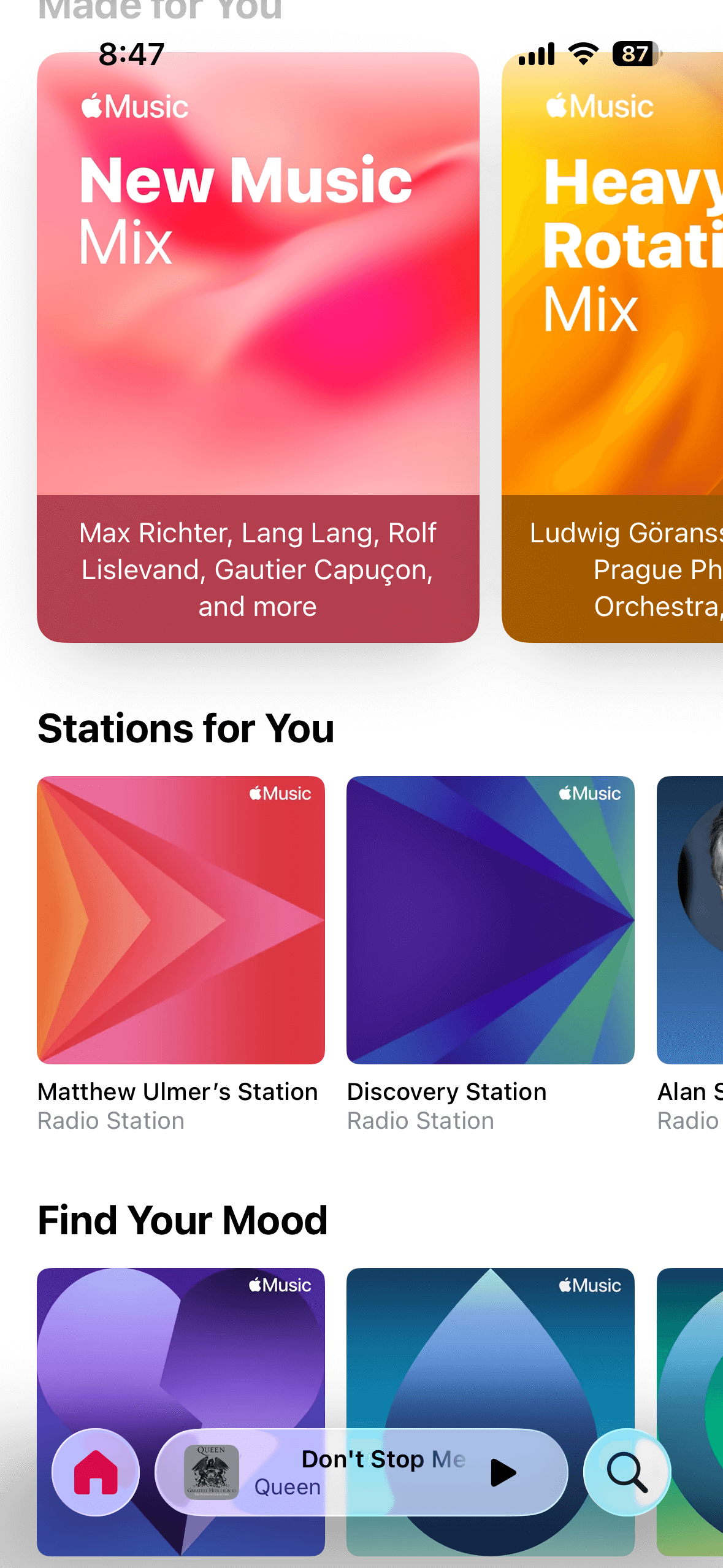
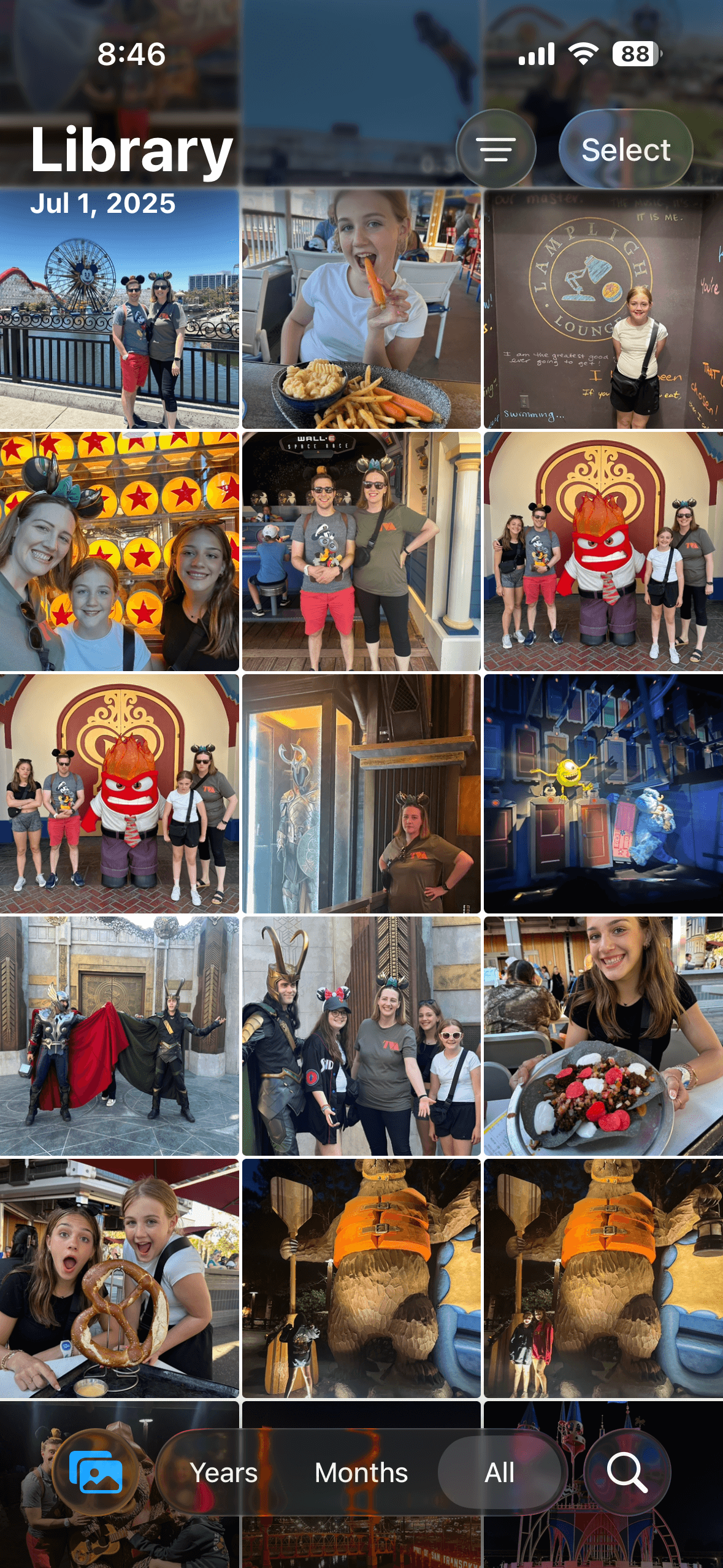
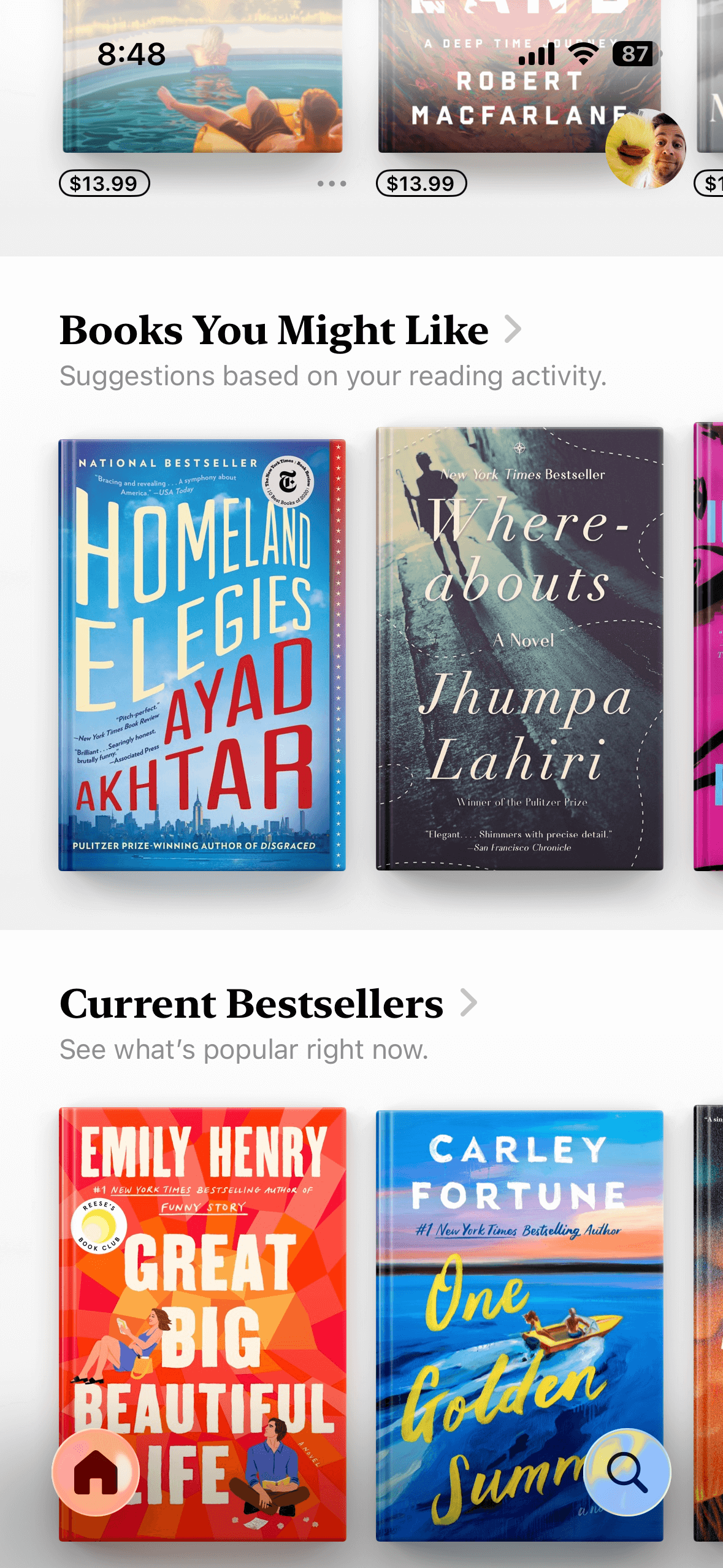
If you haven’t heard about it yet, Apple is calling it Liquid Glass (not to be confused with Liquid Metal of the T-1000 from the 1991 film Terminator 2: Judgement Day).

Elements like back buttons, send and cancel buttons, navigation tabs — truly everything but the primary content of the app — appear like shaded pieces of glass that allow you to see through them to the content. In my opinion, it’s very, very cool.
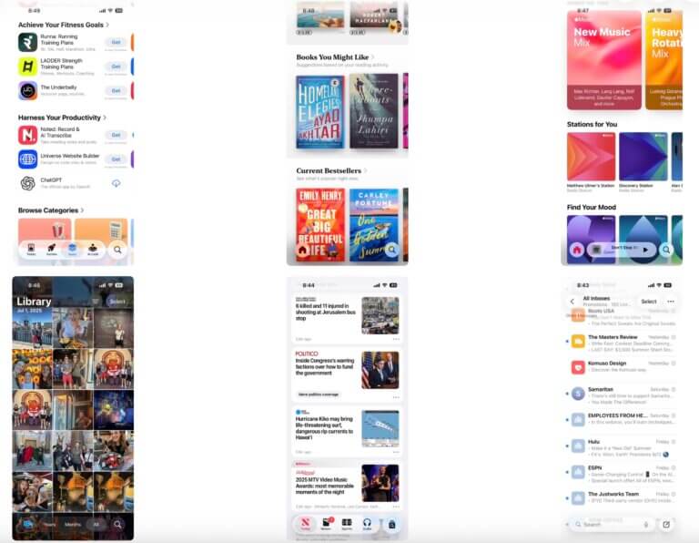
But it also means a design in the typical sense is stripped away. The Mail app and the Messages app and the News app and the App Store app all look the same from a design perspective. The difference is in their content — is it showing you email with glass buttons overtop your inbox or text messages with glass buttons overtop your conversations or news articles with glass buttons overtop your…you get the idea.
How will non-Apple apps adapt to this new language? It has yet to be seen, because no non-Apple apps are updated for it yet, as the operating systems are still only in beta. We won’t know until next week, when the software becomes available to everyone.
But companies will need to get creative to adapt to this new environment while still demonstrating their own uniqueness. Will Facebook and Instagram and Threads look identical save the difference in the actual contents of a Facebook feed versus an Instagram feed versus a Threads feed (if you load a Reel on all three, will you even know which app you’re in?), or will Meta find a way to still clearly brand their separate entities?
I suspect we’ll start to see more experimentation with the texture around content. To understand what I mean, before next week, open the app theScore on your iPhone, or IMDB, or Apple’s own Score app. They all attempt to do something different from the typical app approach (particularly noteworthy if the rest of your device is in light mode instead of dark mode). Will app developers experiment more with how to be different, to stand out amidst a sea of glass?
I can’t wait to find out.