

Mobile or Bust: The Top 3 Reasons Responsive Design is a Necessity

Let’s be honest. It’s 2017, we should probably retire the term “responsive” web design. By now everyone just expects to be able to get anything they want on any device they have. The idea that we have to label this has become dated. If someone hits your site on their phone and it’s not optimized for their experience they are gone. No one has time for that, and there are other options available that will cater to their needs. Like global warming, the dinosaurs, and the lunar landing, the fact that “responsive web design” is now just web design can’t be denied. But just in case you think it’s cool to be warm in the winter, fossils are made of plastic (the real reason you can’t touch them at the museum), and the moon landing was filmed in Hollywood, allow me to share three arguments as to not only why responsive design is important, but why it’s now the standard for web design.
1. The Rise of Mobile Traffic
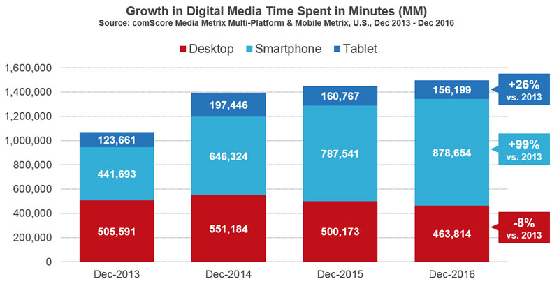
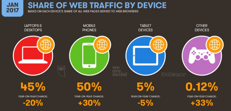
Next time you are out, literally anywhere, look around. How many peoples’ eyes are glues to their phones? In reality, there is a really good chance your eyes are glued to your phone right now. Use of mobile web is in a steady year-over year increase. More and more people are consuming media on their phones while less and less are using their desktop computers. So simply stated, you need to go where their people are. If your content is not easily consumable on mobile devices you will be left behind.
Click to Learn How Google’s Mobile-First Index Can Affect Your Small Business
Mobile phones are now the most popular device for consuming web content. Without a site that can adapt, how will your content be seen? Responsive design is no longer an upgrade feature when building your site, it’s the foundation in which a successful site is built. It will help with your search rankings and force you to streamline and hone the user experience to meet the needs of today’s consumers.
2. Because Google Says So
Our Alphabet Overlords can be quite fickle when it comes to just what goes into their search rankings. They tell us just enough to keep us on our toes and keep our SEO Experts scrambling for the latest information. Based on the rise of mobile traffic, Google must go where the eyeballs are to sell ads and have decried a shift to a Mobile-First Algorithm, which has sent the internet scrambling to make sure they are up-to-date with the search giant’s requirements for optimizing sites to achieve the highest ranking. While this may sound scary, and if you are just learning this you may feel the sky is falling, I ask you one simple question: Is your site responsive? If yes, go on about your day, you should be fine. If not, well then it may be time to reevaluate your website. There are many Google Mobile-First Myths, but one truth is that a responsive web site will be a huge advantage. Bottom line, if you care about Google rankings, your site should be optimized for all devices.
Click to Learn about Google Mobile-First Myths
3. Mobile-First & User Experience

To achieve a successful responsive site, we need to change the way we think about our site. To fully flesh out the concept of mobile-first design is a topic for another day. But in short, mobile-first forces us to tailor our content and user experience to mobile devices. The interesting thing about doing so is that the product is a much more user-focused site. By clearly prioritizing content and user experience, sites can become much more streamlined and to the point as we strip away all the frivolous features that can over complicate a desktop site. This allows our users to easily get what they are looking for and improves on site experience, creating a more successful site.
In other words: Get the mobile design right, then expand it to the desktop.
The New Normal
So, data shows that more people are using mobile devices over all others and it also shows this trend increasing. Google has told us that they are placing a premium on mobile web content. And users who visit a website expect an experience tailored to their situation that allows them to quickly and easily get whatever content they are looking for. Is responsive web design important? It’s so important, it has become not only expected but a necessity of the modern web. While it may still be a buzz word, it’s definitely the new normal.
Want to learn how we marry responsive design and SEO to create fully optimized sites? Click here to contact an Arc representative and talk about goals and strategy.
