

Tips for Creating Site Navigation

A site’s navigation is one of the first things a user sees when they arrive at a site. It’s an important tool to help the user progress through the site and find the information they are looking for. A well-crafted navigation can be the difference between a bounce and a conversion. Let’s look at some tips and best practices to create navigation that works.
Use content hierarchy and site goals to inform navigation decisions.
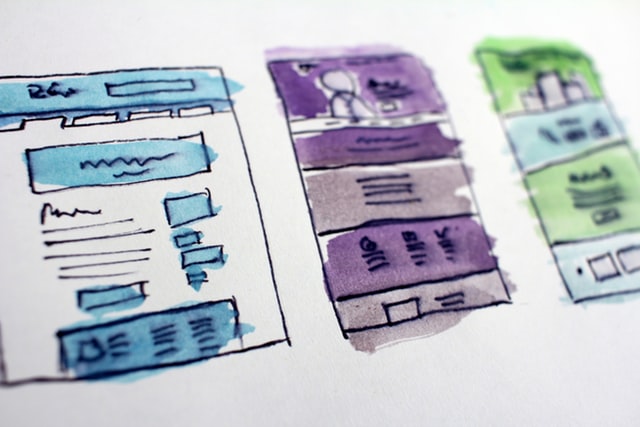
There are many ways to organize your thoughts while constructing your navigation. Flowcharts, spreadsheets, and bulleted lists are all good ways to organize depending on how your brain works. The tool is less important than the process.
When planning a navigation, it’s important to edit down the core pages to what’s important to the user, as well as what are the main starting points you want users to take as you guide them to a goal. There are many ways to direct users to content throughout your site. The main navigation should be reserved for core pages or sections. For example, just because your site has a blog, does not mean the blog is essential to sell your product or service to a potential customer. You can direct people to your blog through other methods like callouts. Similarly, how important is your About Us page? Is it there because you want it there, or because it helps the user’s journey towards the end goal? Keeping the main navigation clean and concise is a great way to help users understand your site and find the content they are looking for.
Keep navigation labels relevant, accurate, and short
Less is more when it comes to wording navigation items. While not always possible, try to strive for one-word labels. Space is typically limited, so don’t use three words when one will do. Avoid using internal or technical terms that a new user may not understand and instead use terms that are familiar to them and will help them get to their goal, such as Services or Products. Lastly, choose labels that simply and accurately explain what the target page is. Navigation labels are not the place to get cute, save the creativity for the page content.
Keep sub navigation minimal when possible
A navigation that has three or four levels of drop downs or flyouts is hard to navigate and creates confusion and lack of focus for a user. Ideally, try to keep your sub navigation to one level and save the second level for special cases. Instead, when a site is very deep, funnel users to a top-level page that provides context and allows them to get deeper into the site after you’ve primed them on their next steps. In certain cases, a mega menu may be appropriate to show users a breath of related sections and pages, but again, it’s important not to overwhelm the user.
Order Matters
As you place items in your navigation, the order matters. A properly thought out content hierarchy can help inform this order. If your content is structured in a way that the content leads a user down a path, consider something like:
If your navigation includes items that are not tightly related, keep in mind that items at the beginning of the list will hold more weight that items in the middle, while the item(s) at the end will get the benefit of being the last items seen. The first item(s) should be the most important and progress through the least important in regard to the site goals, with the final item being another item of importance or usefulness.
Bonus: Other ways to get users around your site
Much of this article stressed simplifying and editing your main navigation. Keeping the main navigation restricted to core pages that serve the site’s goals is key for optimal user flow and conversion. But many sites have much more content that is secondary or supportive to the site’s main goals. There are other ways to direct users around a site besides the main navigation.
Here are a few suggestions:
- In-page callouts – These are a great way to provide access to relevant supporting content or content related to the page’s theme. By placing these items on a page, you are ensuring the content is targeted and relevant.
- Sidebars – Yes, I said sidebars. Not the global sidebars of old that wasted page width and sat empty on many pages. Some subsections of a site can benefit from a set of navigation items that are relevant to the section only and a sidebar can be a way to add that navigation where it’s applicable and needed without clogging up the main navigation.
- Footer – The footer is a great place to augment a site’s navigation. The footer can be used to create sections and curate helpful main and secondary items as a supplement to the main navigation.
Have Questions or Need Help?
As with most case, these tips are general best practices and your project might benefit from a more thoughtful approach. Contact us to discus your digital marketing project and see how we can help you achieve your goals.
